Mobile Web Design
Today’s smart phone’s are awesome; in order for your web site to look good on a modern phone, you need mobile web design. The adoption rate of mobile browsers is sky rocketing, to the tune of 35% in 2018 for some sites. What this means is that people are viewing your site on mobile, and it needs to be more than just visible, it needs to look great on ALL devices: desktop, mobile, tablet, portrait and landscape.
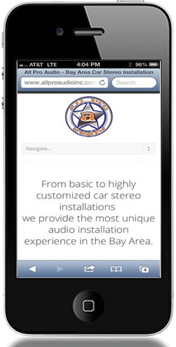
One of the things that can happen on a site not optimized for mobile is the text can be very small, especially inside images and navigation. This means the user would have to do a lot of pinch/zoom scroll, etc. to read and view the site. Take a look at the screenshot to the right of the before and after of mobile. The before shows a site that is unreadable until you zoom in. The after site shows easy to read and navigate design.
Today’s mobile phone friendly web sites are also tablet friendly as well. The technology is called responsive, in that the site responds to the different screen size, and you can specify how big things are etc for each screen size. It all happens on the fly, you don’t have to do anything, once it is setup correctly. To see how responsive design works (if viewing on a desktop), please re-size this browser window. You will see the screen adjust the website to fit the screen, no matter how small all the way to mobile. If you are viewing on a tablet or phone, it’s already showing you the correctly formatted version.
With the number of smart phones in existence and growing daily, millions of people could potentially gain access to your website with their mobile device, but what will they see? If you don’t have a website that is compatible with a mobile device, you could be losing a great deal of business.
The advantages of a mobile web design include: Generating new business, ease of use, simple navigation, improved customer satisfaction, SEO performance, business visibility, If your mobile website is optimized, it means that it’s been designed to fit precisely on the smaller mobile device screen. That way, everything is displayed correctly and in turn, navigating is easy and efficient.
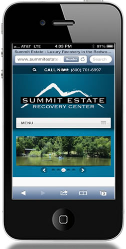
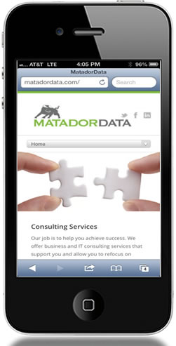
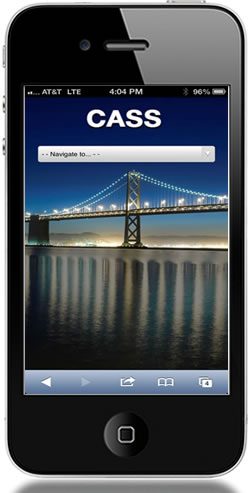
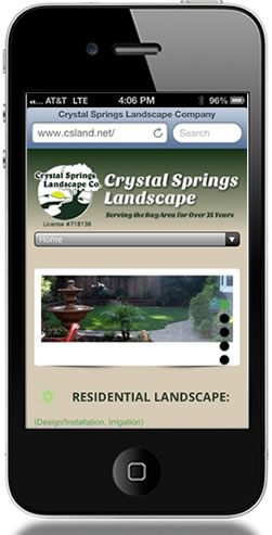
View some examples sites that are responsive, and and look great on desktop, tablet, and mobile phones:
FrontEndTech is rated 5/5 based on 24 ratings & reviews on Google, and Yelp!

